Vase 1
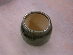
This piece is my first vase. I made it to intentionally widen the lip while keeping the base small and rounded, and the middle to be widened out as well. Although this vase is not tall, its intended to be wider rather than taller. It’s about 5 inches by 3 inches tall, like my lidded project, but much thinner and balanced out. The lip is slightly uneven, which made it difficult to foot because if I had footed it carelessly it would have thrown the whole project off center and therefore off balance. This vase was glazed shadow green as well, to fit the theme of all my projects, and painted the glaze on in specific strips so that it would run darker into a lighter pattern and give a striped effect.
Theme
Just kidding...revised theme. 01/13/2011 0 Comments Edit | Settings | Delete Are you sure you want to delete this post? This action is permanent. Yes, delete postNo, keep post The theme of my projects isn't hawaiian-based like i planned it to be. One because that theme doesn't fit at all after looking at all my projects. Two because i decided on that theme after not looking at my projects all lined up for a while, where i then realized that Hawaii had nothing to do with them at all. So instead, the theme i decided on was a forest theme, which relates to Washington as well. Each one of my projects is tinted with dark, earthy colors like purple, brown, black, and green
Ceramics Essay
Ceramics Essay
The theme of my ceramics sets was based off of Washington state’s forest settings. Each of the projects in the set was formed relatively the same way. Each one was wheel-made, and have nearly the same shape. Each is of medium height, cylindrical, and of medium thickness. Admittedly, each one is not perfectly on center, but rather slightly off to the right or the left, as can be seen in some throwing marks on the sides of the projects underneath the sheen of glazes covering its surface. Following the shape of the projects, the glazes covering each one help emphasize how it was made. For example, on the set of three, each was glazed a dark black, with a certain section cut out and glazed a deep purple, to accent the colors and draw the eye to pay attention to the shape of the project rather than just the pretty color combinations.
Each project designed around the theme is different. I created a set of three bowls, twin cups, two slab plates, twin vases, a lidded project, and a pitcher based around the theme. The set of three bowls, as mentioned above, has different colored glazes that combine to draw attention, but not clash together awkwardly. The two cups, although different sizes, have the same glazes in the exact same spots, as well as a spiraling design of black glaze around the cup and stopping at the handle. The slab plates are identical in size and shape, but are glazed different colors that contrast against each other. One is bright green, and one is a darker blue-ish green. The two vases I made are different sizes and also different colors, but have the same leaf spiraling pattern winding up and around the body. the same goes for the lidded project, the lid is glazed different from the body on purpose, to make it stand out from looking like one whole piece. Finally, the pitcher is tall, but glazed half dark, and half light colored, and the line separating the two is hard to distinguish on purpose, so it gives the effect of gradually fading from one color gracefully into the next.
By painting the glazes on according to the size and shape of each project, this further illuminates the appearance of the entire project as a whole. Rather than remarking on the shape of each, or the colors involved with each, by combining these two elements together, it helps in looking at the piece as a whole instead of just bits and pieces of it that stand out or catch your eye. As a whole, the project is much easier and more interesting to look at than just parts of it that you would see if you didn’t combine these two elements together.
From looking at the projects I created, you can tell that the swirling marks pulling upward reflect on the shape of the projects. Instead of removing the throwing marks created from my fingers pulling the projects up on the wheel, I chose to leave them so I could accent them with glaze once they were bisqued in the kiln. As it turns out, each of these throwing marks worked out well for the glaze patterns I chose, and throw the patterns into relief. By throwing the patters into relief, as being physical patterns instead of just visual patterns, this shows off the project more, and also accents it.
In conclusion, making these projects proved to be both difficult and frustrating at times, and never exactly easy, but in the end they turned out very nicely and I’m satisfied with the results. The theme worked out for every set included. Even from taking ceramics last year, this year in advanced I’ve attained a better understanding as to how glaze and shape really does affect the overall visual of the project you create, and how by altering and tweaking certain parts can change the whole project; sometimes for the better, or sometimes for the worse. I’ve also learned to be creative with glazes and shape, because no matter how it turns out there’s nothing stopping you from adding your own personal touch and making a project that reflects you, not just the theme you designed it upon.
